The Module 'Bivariate Exploration'
Content
Purpose and short description
The left hand panel: select fields and value ranges
The bivariate matrix
The circle plot
The bottom tool bar
Selecting and exploring matrix cells
Purpose and short description
The data exploration module 'Bivariate Exploration' serves to study the dependencies and interrelations between the different values of two data fields in detail. This is done by creating a value combination matrix in which the values of the one field (the 'x-axis field') define the columns and the values of the other field (the 'y-axis field') define the matrix rows. A bivariate exploration can answer the following questions:
-
Are there any correlations between the two fields, or are the values of the two fields statistically independent?
-
If there are correlations, which values and value ranges are positively correlated and which 'repel' each other?
-
Are there any combinations of values or value ranges which appear extremely less frequently than expected? This could be an indication for a data fault. Example: FAMILY_STATUS=child with AGE>18.
-
How high is the absolute number of occurrences of certain combinations of values of the two fields?
The left hand panel: select fields and value ranges
In the left part of the module's screen window you can select the two data fields whose values are to be traced and whose interrelations are to be examined. This can be done by clicking on the 'arrow down' symbol at the right border of the white selection boxes below the head lines 'x-axis' and 'y-axis'. In the following screenshot, the sample data doc/sample_data/customers.txt has been imported into Synop Analyzer, and the two data fields FamilyStatus and Age have been selected as the two data fields on which a bivariate exploration is to be performed.
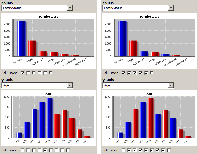
In the same screen part in which you select the data fields you also specify how fine-grained the values of the two data fields are to be treated in the bivariate analysis. This is done by selecting or deselecting some of the checkboxes below the histogram charts of the two data fields. Each checkbox stands for one possible value range split between two values or value ranges which are represented by one histogram bar in the chart above the checkbox. Therefore, the number of checkboxes is always the number of histogram bars minus one. Only if the check box is selected (marked), the corresponding range split is activated. Each color change between a red bar and a blue bar in the histogram above the check boxes represents one value range split. The neighbored values or value ranges whose histogram bars show the same color are considered one single value range within the bivariate analysis.
The left side of the figure above shows a rather 'coarse-grained' value range specification. On the x-axis, only the value marriedis separated from the other values, all remaining values are treated as one single value range. On the y-axis, we have set one single range split at the age of 50. That means, two value ranges will be created: Age<50 and Age≥50.
The right side of the figure above shows a more fine-grained value range specification. Almost all possible range splits have been set. Only some low-frequency values have been combined: on the x-axis the values separated and cohabitant, on the y-axis the value ranges Age<10 and Age=10..20 as well as Age=80..90 and Age≥90.
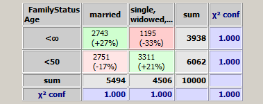
Accordingly, the biariate matrix resulting from the range specification on the left side is very small:
whereas the bivariate matrix resulting from the range specification on the right side is much more detailed:
The bivariate matrix
The preceding section has described how a bivariate matrix such as the one in the figure above is generated. This sections will discuss which information can be derived from it.
-
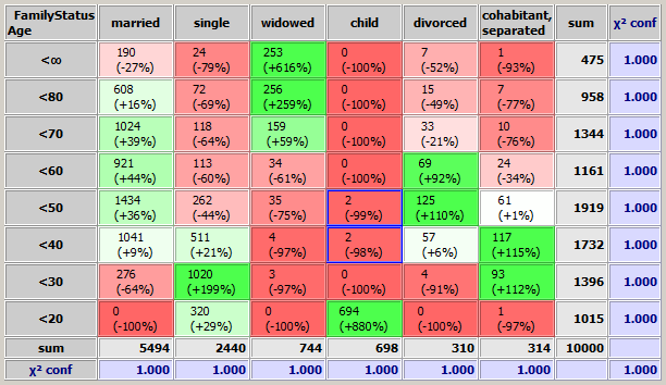
The 'Sum' column with gray background color indicates on how many data records (or data groups if a group field has been defined) the y-axis field has the value in the value range represented by the matrix row in which the 'sum' value is situated. For example, the number 475 in the first row of the 'Sum' column in the figure above indicates that in 475 data records the data field Age has a value ≥80. The 'Sum' row plays an analogous role for the x-axis field. The number 5494 in the leftmost field of the 'Sum' row in the figure above indicates that in 5494 data records the data field FamilyStatus has the value married.
-
The number on the intersection of the sum row and the sum column - in the figure above the number '10000' - is the total number of data records (or data groups if a group field has been defined) on which the bivariate analysis was performed. If in the tool bar the checkbox Ignore missing/invalid values has not been checked, than this is the total number if data records or data groups in the input data. If the checkbox has been marked, it is the total number of data records or data groups on which both involved data fields have a valid value.
-
The upper number in each pink or green colored matrix cell indicates the number of data records (or data groups if a group field has been defined) on which the corresponding combination of values of the two data fields occurs. For example, in the figure above, the number 190 in the pink matrix cell on the top left corner indicates that in 190 data records the field Age has a value in the range ≥80 and the field FamilyStatus has the value married.
-
The second number in each matrix cell indicates how much the value of the upper number differs from its expected value. The expected value is the value which would arrise if the occurrence frequency of the combination of x-axis value and y-axis value occurred exactly as often as could be expected from the two values' occurrence probability. For example, the number '-27%' in the pink top-left matrix cell is the result of the following computation:
N_expected = 475/10000 * 5494/10000 * 10000 = 260.965

-27% = (190 - 260.965) / 260.965.
The coloring of the cells' background is defined by the percentage number: the stronger below zero the more intensively red, the stronger above zero the more intensively green.
In other words: pink and red cells represent combinations of values which occur unexpectedly rarely (negative correlation), green cells represent combinations of values which occur unexpectedly frequently (positive correlation).
-
Each value in the 'χ2 conf.' column with blue background color contains the statistical significance (confidence) of the differences between the expected and the actual occurrence frequencies in the matrix row in which the value is placed.
In colloquial words: if the confidence value is larger than 0.95 (0.99, 1.000) then one can be 95% (99%, 100%) sure that the observed differences between actual and expected frequences are a statistically significant pattern and not random fluctuations.
In mathematically precise words: the 'χ2 conf.' value is the confidence level at which a χ2 test with C-1 degrees of freedom and the following null hypothesis is rejected: "the actual occurrence frequencies in the matrix row have the same probability distribution as the expected occurrence frequencies." (Here, C is the number of matrix columns; in the figure above, C is 6.)
An analogous definition holds for the 'χ2 conf' values in the row with blue background color.
-
The number at the intersection of the 'χ2 conf' row and the 'χ2< conf' column contains the statistical significance level of the deviations between expected and actual occurrence frequencies on the entire matrix.
In colloquial words: if the overall confidence value is larger than 0.95 (0.99, 1.000), one can be 95% (99%, 100%) sure that there is some statistically significant Korrelation between the two data fields, that means they are not statistically independent.
In mathematically precise words: the overall confidence number is the confidence level at which a χ2 test with (R-1)*(C-1) degrees of freedom rejects the following null hypothesis: "The actual occurrence frequencies on the entire matrix have the same probability distribution as the theoretically expected occurrence frequencies." (Here, C is the number of matrix columns and R is the number of matrix rows).
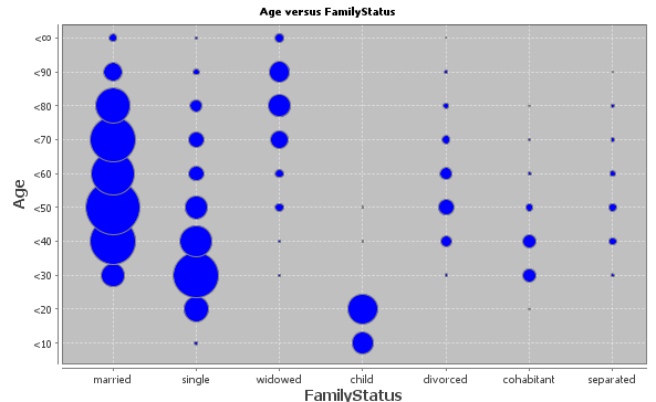
The circle plot
The bivariate matrix and the color scheme of its cells focus on visualizing relative differences between actual and expected frequencies of different combinations of values of the two involved fields. A second graphical visualizations of the interrelations between the two fields is given in the chart with the blue circles below the matrix. It displays the absolute size (measured in the number of data records respectively data groups) of the different possible combinations of field values. Each circle stands for one combination of field values, and the area of the circle is propoertional to the occurrence frequency.
From this plot one can understand very easily which combinations occur most frequently. On the other hand, also the most extremely untypical combinations can be detected quite easily in the form of little blue spot far away from any large circle in the same row or column of the plot. For example, the plot shown below contains two little blue dots in the column for the value child which are far above the typical age range of 0 to 20 years: these are children with ages between 30 and 50 years:
The bottom tool bar
The tool bar at the lower border of the screen provides the following functions:

-
 :
:
By pressing this button, you can hide the circle plot whose blue circles (disks) show the absolute population sizes of all possible value combinations of the two selected data fields.
-
 :
:
By pressing this button, you can invert the red-green color scheme in the bivariate matrix. Per default, value combinations (matrix cells) which appear more frequently than expected are colored green, combinations which appear less frequently than expected are colored red. If the quantity counted within the cells represents something negative, e.g. cost or error cases, it is often more intuitive that larger counts are colored red (problem hot spots) and smaller counts are colored green (less error-prone cases).
-
Ignore missing/invalid values:
If this checkbox is not marked, all data records will be used and counted when creating the bivariate matrix. If the checkbox is not marked, only the data records which have valid values in both involved fields are being counted.
-
Selected:
The absolute and relative number of currently selected data records (or data groups if a group field has been selected).
-
 :
:
Deletes all selections of matrix cells (which are signaled by blue frames).
-
 :
:
Starts a multivariate exploration of the data records in the currently selected cells of the bivariate matrix. See section Multivariate exploration of selected matrix cells.
-
 :
:
Starts a split analysis. The data records in the currently selected cells of the bivariate matrix are the test group, all other data records form the control group.
-
 :
:
By pressing this button, you can save the currently active data import settings and all settings performed in this module to a persistent XML parameter file. This file can later be opened via Synop Analyzer's main menu (Analysis → Run Bivariate Exploration). In this way you can exactly reproduce the current data analysis screen without to be obliged to re-enter all settings and customizations.
-
 :
:
Eport the current data exploration results within this module into a spreadsheet in .xlsx format (MS-Excel© 2007+). The spreadsheet contains several worksheets: one with png graphics of the two charts on the right side of the bivariate exploration panel, one with the bivariate matrix in the form of an editable, sortable worksheet. And if some bivariate matrix cells have been selected, there are two more sheets containing the selected data records in tabular form as well as a multivariate exploration of these records compared to the entire data.
Selecting and exploring matrix cells
By clicking with the left mouse button one can select a cell of the bivariate matrix. If you keep the <CTRL> key pressed during mouse-clicking, you can select several matrix cells. Once one or more cells have been selected, the bottom tool bar of the bivariate analysis panel shows the total number of data records (or data groups if a group field has been specified) in the selected cells. By clicking the button you can open a new multivariate exploration panel inwhich the value distributions of the selected data records (or data groups) are compared to the value distributions on the entire data.
We want to demonstrate this with the help of the example which has been shown above: the bivariate matrix showing the interrelations between the data fields Age and Family Status from the sample data doc/sample_data/customers.txt. In this matrix we have selected two noticeable cells, presumable data errors: children at ages between 30 and 50 years.
The multivariate epxploration of the four data sets from these two cells shows that most probably the age is correct by the family status is outdated, since the other properties of these data records, for example the account balance or the elevated accounting activity are more typical for adults than for children.