The Module 'Pivot Tables'
Content
Purpose and short description
The left hand panel: select fields and value ranges
The bottom tool bar
The table view
The chart view
Purpose and short description
The data exploration module 'Pivot Tables' serves to study the dependencies and interrelations between the different values of several data fields in a tabular view. The module can be considered a functionally enlarged variant of the Bivariate Exploration module, offering the following additional features:
-
The value ranges which define the horizontal and the vertical dimension of the displayed table can come from more than one data field, and there are more degrees of freedom as to joining, rearranging and dropping certain data field ranges.
-
There are more choices as to which quantity is displayed in the main cells of the table. Bivariate Exploration always displays the number of data records or data groups. In Pivot Tables, we can also display certain statistical measures of further data field, such as mean, minimum, maximum or the field's value sum.
-
There are several different coloring schemes which define the color-coding of the background of the pivot table cells.
-
You can pre-filter the data which enter into the analysis.
-
You can connect two pivot tables by computation formulas.
-
You can transform the table view into a chart view.
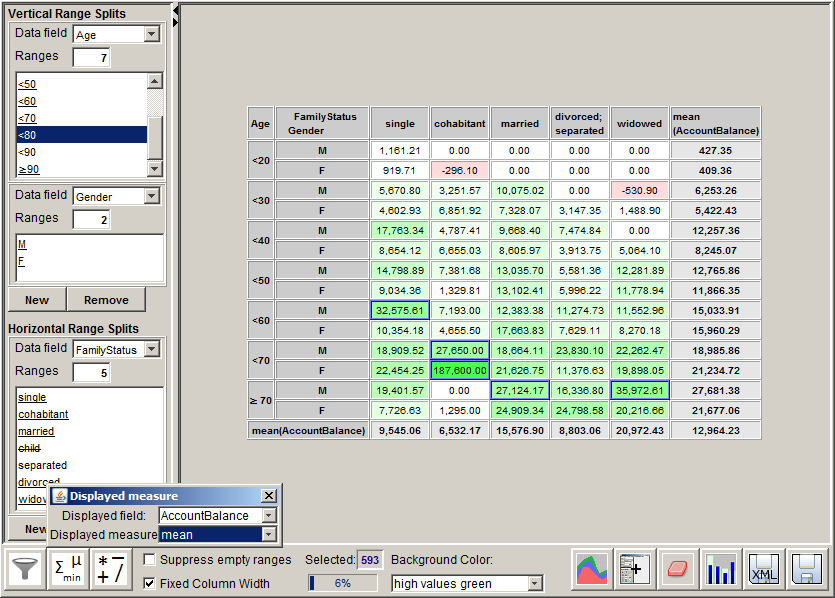
The screenshot below shows a sample application: the table displays the mean account balances of bank customers traced by age, gender and family status. The ranges which have been marked with a blue line are the ranges in which the average account balance is at least twice the mean account balance on all customers.
The left hand panel: select fields and value ranges
In the left part of the module's screen window you can select the data fields and the field value ranges which will define the rows and the columns of the pivot table.
The buttons New below the headlines Vertical Ranges and Horizontal Ranges create a new range split for either the x- or the y-axis of the resulting table, each range split being based on one single data field. After pressing the button, a new range specification window appears in the left screen column. In the selector box Data Field you select the data field on which the range split will be based.
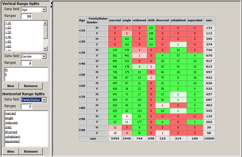
The screenshot printed below shows the pivot table which results from choosing the vertical range split fields Age and Gender and the horizontal range split field FamilyStatus on the data doc/sample_data/customers.txt. This pivot table is very similar to the bivariate matrix created by the module 'Bivariate Exploration' for the two data fields Age and FamilyStatus.
Each range split can be modified by mouse actions on the list area showing the single field values. There are three different display modes for each list entry, each display mode representing a certain usage mode of the corresponding field value.
-
If the field value is underlined, this means that after the field value a new value range, that means a new table row or column, begins.
-
If the field value is striked through, this means that the field value and all data records containing this value are suppressed in the pivot table and do not contribute to the displayed aggregation value shown in the table cells.
-
If the field value is neither underlined nor striked through, this means that the data records containing the value contribute to the table, but they form a single table row or column together with the folling value in the list.
The following mouse actions are supported on the list area:
-
A left mouse click on one of the list entries removes or adds a range split, that means it toggles between underlined and normal display mode.
-
A mouse click with the middle or right mouse button on one of the list entries activates or deactivates the corresponding field value, that means it toggles between striked throgh and normal display mode.
-
By drawing with the mouse (that means by keeping the left mouse button pressed while moving a list entry to a new position within the list) you can rearrange the field value order of textual data fields. Numeric fields, on the contrary, have an inherent natural ordering ('smaller than'), therefore a reordering makes no sense here.
The picture displayed below shows on its left side the default state of the range split definition window for the data field FamilyStatus of the data file doc/sample_data/customers.txt. On the right side, the picture shows a user-modified state.
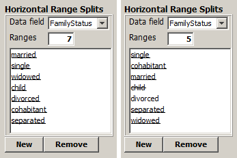
The default state creates the pivot table with 7 horizontal ranges shown at the beginning of this section. The nodified state creates a pivot table such as the one shown in the introductory section of this chapter. That table has only 5 horizontal ranges. The value child has been suppressed, the values divorced and separated have been combined into one single range, and the ranges have been reordered into the 'logical' order: single before cohabitant before married before separated; divorced before widowed.
The bottom tool bar
The tool bar at the lower border of the screen provides the following functions:

-
 :
:
This button opens a pop-up window in which a data prefiltering can be defined. The prefiltering restricts the set of data records which will enter into the pivot tables. It is performed on a multivariate exploration panel view in which the data field values to be filtered out can be deselected.
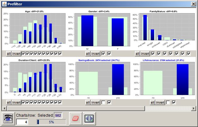
The screenshot shown above displays an example for a data prefiltering: it filters out all data records representing customers who do not have a savings book or who di not have a life insurance.
-
 :
:
Via this button you can specify the measure to be displayed in the pivot table. Per default, the number of data records or data groups is displayed in the pivot table. Using the two selection boxes Displayed field and Displayed measure in the pop-up dialog, you can tell the pivot table to display a statistical measure of a selected numeric data field instead, for example one of the quantities mean, sum, minimum or maximum.
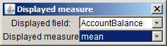
In the screenshot shown above, the mean account balance has been chosen as the measure to be displayed.
-
 :
:
Here you can specify a second pivot table. The current pivot table's values will then be submitted to a mathematical operation (addition, subtraction, multiplication or division) with the corresponding table cell values of the second pivot table. Eligible for being chosen as second table are all currently opened pivot tables whose number of rows respectively columns is either 1 or equal to the number of rows respectively columns of the current pivot table.
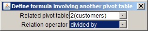
In the screenshot displayed above, the pivot table in the second currently opened pivot table panel for the data source customers has been selected as the related table. The specified computation operation for the relation is divided by. That means, in the current pivot table, the value of each numeric table cell will be divided by the value of the corresponding cell in the pivot table 2(customers) before it is displayed on screen.
A sample application scenario of that feature is calculating failure rates (isochronous lines) in technical quality monitoring. Assume that we have created a pivot table which traces failure counts as a function of production period (table rows) and usage time (table columns). If we then create a second pivot table which traces production numbers as a function of production period (table rows), we can relate our first pivot table to the second one using the computation operator divided by. The resulting pivot table (or its resulting chart view) then shows isochronous failure rate lines.
-
Suppress empty ranges:
If this checkbox is marked, all columns and rows of the pivot table will be removed which only contain the value 0.
-
Fixed Column Width:
If this checkbox is marked, columns of the pivot table will have the same fixed width. If the checkbox is not marked, each column only has the minimum required width for displaying all its content.
-
 :
:
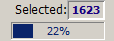
The progress bar and the text field Selected show the size of the currently selected subset of the data: the number in the progress bar is the percentage of the entire data; the number to the right of the Selected label is the absolute number of data records (or data groups if a group field has been specified) in all currently selected cells of the pivot table.
Left clicking with the mouse on the progress bar or the output field showing the number of selected data groups opens a pop-up window which shows the currently applied selection criteria in the form of a SQL SELECT statement. By pressing a button in the pop-up window, you can copy this statement into the system clipboard and insert it from there into a SQL script which you can then deploy on your database management system.
-
Background Color:
By means of this selection box you can specify the coloring scheme for the background of the pivot table cells. Besides the neutral white background mode there are two modes which color-code the absolute size of the number in the table cell ('high values green' and 'high values red'), and two modes which are similar to the color-coding of the Bivariate Exploration module and which measure the difference between the actual and the expected value of the table cell.
-
 :
:
Opens a pop-up window in which a chart representation of the current pivot table can be created. The chart representation will be explained in detail in the last section of this chapter.
-
 :
:
Creates a new in-memory data source which represents the current content of the pivot table. That means, the data fields of the new data source are the column header names of the pivot table, and the data records are the numeric-valued rows of the pivot table (except the final summary row, which is ignored). The new data source will be displayed in a newly created tab in the left column of the Synop Analyzer workbench; it can be used for arbitrary new analysis steps.
-
 :
:
Deletes all selections of table cells (which are signaled by blue frames).
-
 :
:
Starts a multivariate exploration of the data records in the currently selected cells of the pivot table.
-
 :
:
By pressing this button, you can save the currently active data import settings and all settings performed in this module to a persistent XML parameter file. This file can later be opened via Synop Analyzer's main menu (Analysis → Run Pivot Table). In this way you can exactly reproduce the current data analysis screen without to be obliged to re-enter all settings and customizations.
-
 :
:
Exports the current data exploration results within this module into a spreadsheet in .xlsx format (MS-Excel© 2007+). The spreadsheet contains several worksheets: one with png graphics of the two charts on the right side of the bivariate exploration panel, one with the bivariate matrix in the form of an editable, sortable worksheet. And if some bivariate matrix cells have been selected, there are two more sheets containing the selected data records in tabular form as well as a multivariate exploration of these records compared to the entire data.
The pivot table panel
The preceding sections have described how a pivot table view can be generated and modified using the left-hand panel and the bottom toolbar. The resulting table is displayed in the main part of the panel.
The screenshot below shows a sample application: the table displays the mean account balances of bank customers from file doc/sample_data/customers.txttraced by age, gender and family status. The ranges which have been marked with a blue line are the ranges in which the average account balance is at least twice the mean account balance on all customers.
The table contains the following rows and columns:
-
One or more header rows and columns with gray background contain the range selection criteria, that means the data fields and their value ranges which define the specific table row or columns.
-
The table cell in the lower right corner contains the value of the measure to be displayed in the table on the entire data. In the screenshot shown above, it is the number 12964.32, the average account balance of all 10000 customers.
-
The last column and the last row of the table display the mean value of the measure displayed in the table on the data subset specified by the corresponding header column or row. For example, the number 9545.06 in the second cell of the last row indicates that the mean account balance of the singles among the customers is 9545.06.
-
The remaining table cells (with white, pink or green background) show the value of the measure to be displayed in the table on the data records which form the intersection of the data subsets representing the table row and the table column.
The chart panel
Using the toolbar button
you can create a chart representation of the pivot table's content. The row names of the pivot table will become the labels on the chart's x-axis, the chart's y-axis will show the values displayed in the numeric pivot table cells. Each column name of the pivot table defines a uniquely colored area in the chart. The areas are stacked above each other so that the upper end of the chart represents the number printed in the rightmost table cell of the pivot table.
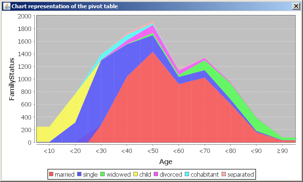
The chart shown above displays the chart representation of the pivot table printed in section 'The left column' which has customers' Age ranges as rows and customers' FamilyStatus as columns.