The Time Series Analysis and Forecasting module
Content
Purpose and short description
Required data properties
The summary plot
The detail plots
The bottom tool bar
Settings for calculating forecasts
Basic settings for the chart generation
Advanced settings for the chart generation
Saving and exporting settings and results
Purpose and short description
In the Time Series panel, time series can be explored and forecasts can be calculated using various forecasting algorithms. This module can only be started on data which fulfill the following requirements:
-
An order field has been defined in the Select active fields dialog. This field will be the x-axis field in the time series charts.
-
A weight/price field has been defined in the Select active fields dialog. This field will be the y-axis field in the time series charts.
-
Not more than two further active fields exist (plus optionally a group field). All other fields have been deactivated in the Select active fields dialog.
Required data properties
In the following sections we will explain the features and functions of the time series analysis module at the example of the MS Excel file doc/sample_data/earnings_sheet.xls. The file contains the monthly earnings sheet for a small company with two locations for the period from January 2006 to March 2009. The figure below shoes a part of this Excel sheet:

In the present form, the data are not really suitable for being used by a forecasting and trend analysis tool: in the Excel sheet, meta data information (such as location, date or cost category) is intermixed with number cells, empty space cells, formula cells (such as EBT or Gross Profit II) and auxiliary title or text cells. Furthermore, the sheet contains accountant's corrections at year end (such as the column 13.2006 in the picture above); these corrections have to be distributed on the 12 months of the preceding year before the corresponding time series can be used for a forecast or trend analysis. We will see that Synop Analyzer supports various preprocessing steps on this input sheet in order to overcome the aforementioned problems.
From the Synop Analyzer main menu, we select File → Import data from spreadsheet. A file chooser dialog opens up.
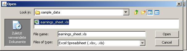
We select the file doc/sample_data/earnings_sheet.xls in the file chooser dialog. A new Spreadsheet window opens on the main canvas:
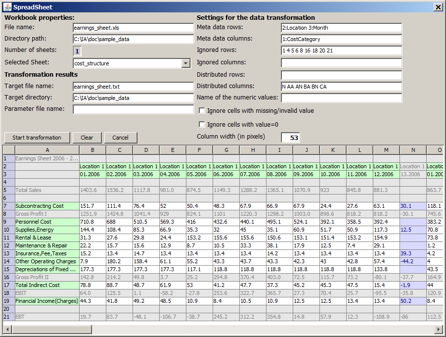
The upper right part of the window contains several input fields in which we can specify how the spreadsheet is to be used. The lower part of the window shows the effects of these specifications.
-
In the field Meta data rows we specify that the second and third row of the Excel sheet contain two different kinds of meta data information which we would like to use in our analysis. By typing
2:Location 3:Month we indicate that we want to refer to the meta data in row 2 under the label Location and to the meta data in row 3 under the label Month.
-
Similarly, we indicate that the first column (A) of the Excel sheet contains a meta data information to which we want to refer under the label CostCategory.
-
Our goal in this example is a cost structure analysis. Therefore, we only maintain the rows containing the various cost category figures and we discard the other figures such as Total Sales, Gross Profit, EBIT or EBT. That's why we type
1 4 5 6 8 16 18 20 21 into the field Ignored rows.
-
The columns N, AA, AN, BA, BN and CA of the Excel sheet contain the accountant's corrections at year-end for the two locations. We want to distribute these corrections equally on the 12 months preceding the correction and discard the correction month 13. Therefore, we enter
N AA AN BA BN CA in the input field Distributed columns.
The specifications decribed above are automatically reflected by an adapted coloring scheme in the tabular representation of the currently active spreadsheet in the lower part of the screen: spreadsheet cells containing meta data information are displayed with a green background, cells with values to be distributed among other cells have a blue background, cells which are to be ignored are grayed out and 'normal' value cells are displayed with white background.
Finally, we click on the Start Transformation button. An instant later, the pop-up window closes and the transformed flat file earnings_sheet.txt is written into our chosen target directory.
The generated file contains the columns Location, Month, CostCategory and Value. The new file is suitable for a statistical analysis using the entire set of Synop Analyzer functions. The time series analysis module requires that an order (timestamp) field and a weight (cost) field have been specified on the input data source.
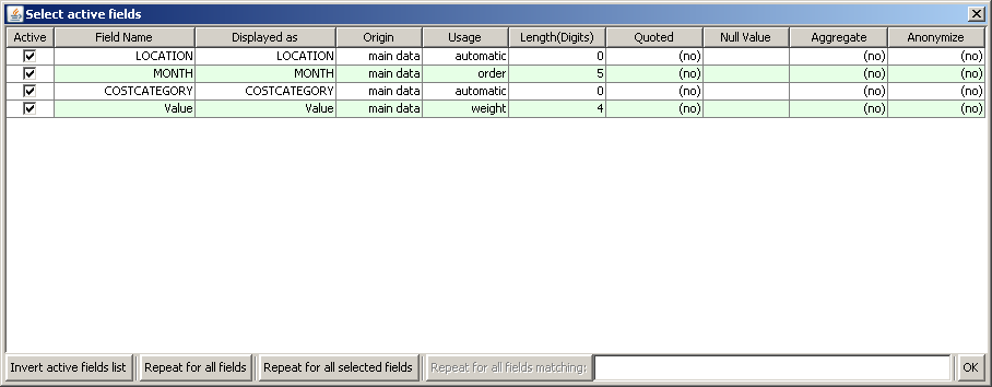
In the dialog Select Active Fields we manually define the field usage of Month as order and the usage of Value as weight. Then we press OK. After that, we re-read the data by pressing the Start button. The button Time Series Analysis is now active.
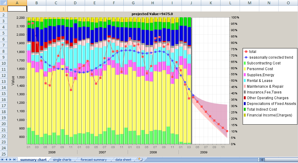
The summary plot
We click on the Time series analysis button for starting the forecasting and trending analysis. A new tab Time Series pops up:
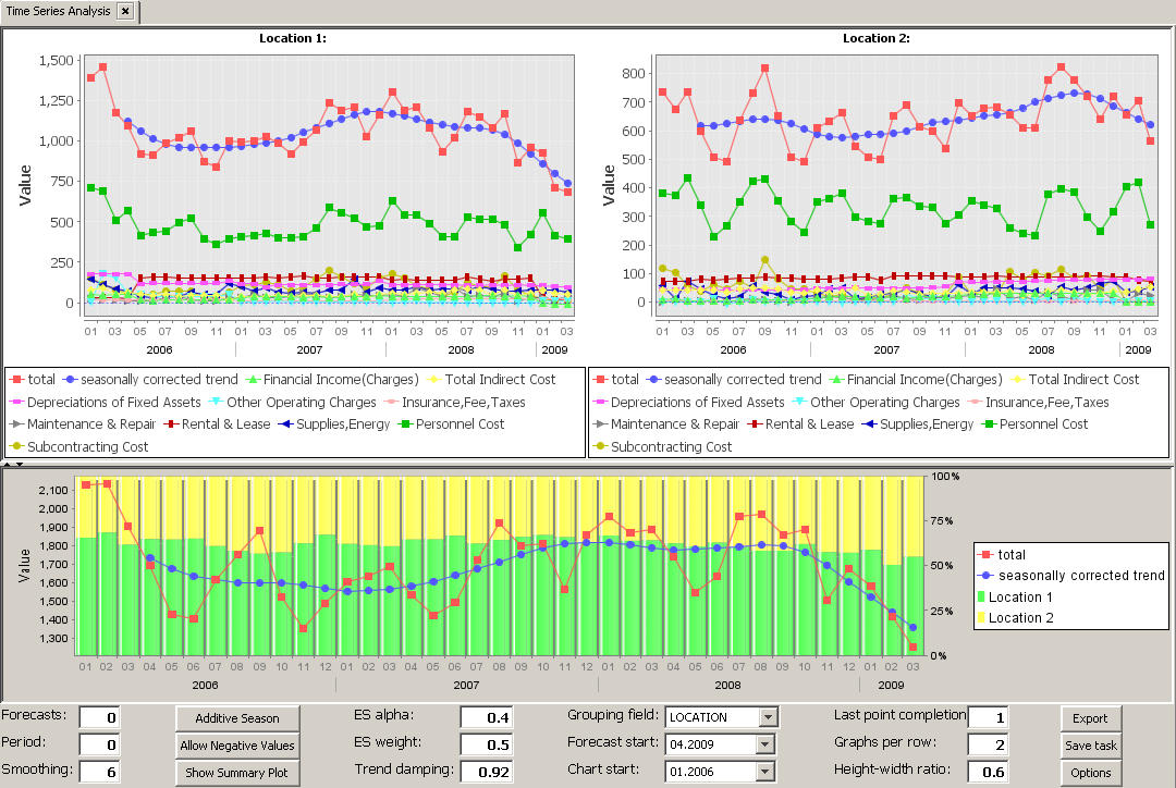
The Time Series tab has three vertically arranged regions:
-
A detail view in which a separate time series chart for each value of the currently selected grouping field is shown (in our case Location 1 and Location 2).
-
A global view in which the total monthly cost is shown (red line), together with its seasonally corrected trend (blue line) and the percental distribution of total monthly cost among the two locations.
-
A tool bar which permits to interactively work with the data, perform a trend analysis and calculate forecasts.
The detail plots
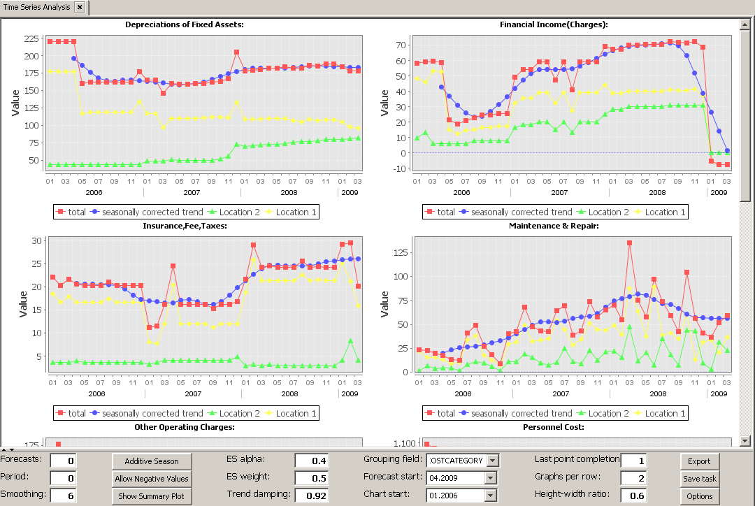
The upper part of the screen shows one single line chart for each value of the data field which has been selected as the grouping field in the toolbar. In example shown below, we have selected the field CostCategory as the grouping field; in this case, there is one single plot for each cost category.
Tip: mark a region inside one of the charts an drag a region with pressed left mouse button will enhance this region within all other charts.
The bottom tool bar
The displayed graphs and charts are depending on the settings in the tool bar.

Settings for calculating forecasts
-
Forecasts:
Number of forecasts, e.g. 3 for the following 3 periods (days, months, years etc.)
-
Period:
Presumed cycle length of the seasonal (periodic) part of the time series in units of the time step between adjacent data points. For example, if a yearly repeating pattern is presumed on monthly recorded data, enter 12 here.
-
Smoothing:
Number of time points for moving averages (trend lines). The trend lines are calculated as the symmetric moving average value of width 'Smoothing'. For example, if 'Smoothing' is 6, then the blue trend line values tr(T) at time point T are calculated from the red line values v(T) as tr(T) = v(T-3)/2 + v(T-2) + v(T-1) + v(T) + v(T+1) + v(T+2) + v(T+3)/2.
-
Additive / Multiplicative Season:
Multiplicative season means that the seasonal pattern is modeled as a correction factor to the long-term trend ('total = trend * season'). As a result, the amplitude of the seasonal fluctuation increases when the trend line increases, and it decreases when the trend line decreases. Additive season means that the seasonal pattern is modeled as an added term to the long-term trend ('total = trend + season'). As a result, the amplitude of the seasonal fluctuations is constant and does not grow when the trend line increases.
-
Allow Negative Values:
Specifies whether the predicted time series values can be negative or whether they will always be equal to or larger than zero.
-
ES alpha:
Exponential Smoothing coefficient alpha (defines a damping factor (1-alpha) per time step to the Exponential Smoothing contribution of the forecast.)
-
ES weight:
Weight prefactor to the Exponential Smoothing part of the forecast; weight=0 switches off the Exponential Smoothing.
-
Trend damping:
Damping factor per time step. The damping factor is applied when projecting the current trend into the future.
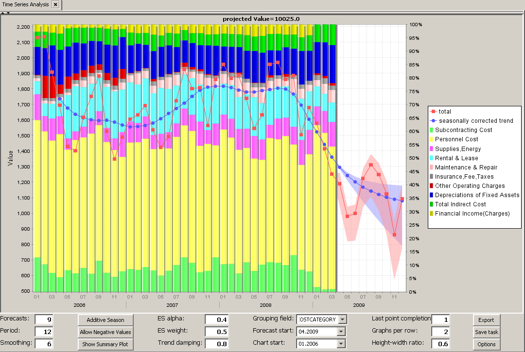
In our example, data are available until March 2009 including. We want to create a forecast until end of the year, so 9 more montha. Furthermore, we see that the cost curve over the past years shows a cycle of 12 months. So we set the two parameters Forecasts and Period to the appropriate values and reduce the trend damping factor to 0.8:
Basic settings for the chart generation
-
Show / Hide Summary Plot:
Activate/deactive the lower window part with the stacked bar chart.
-
Grouping field:
For each values of this field a separate detail chart is built.
-
Forecast start:
Starting time point for calculating the aggregated forecast values which are shown below the title line of each chart in the time series forecast screen.
-
Chart start:
First time point shown in the time series charts.
-
Last point completion:
Completion rate of the last time point, compared to the earlier time points. For example, if the last time point contains the aggregated sales amount of the first 14 out of 26 business days of the current months, the last point's completion should be set to 0.538 (= 14/26).
-
Graphs per row:
Number of detail graphs displayed per screen row.
-
Height-width ratio:
Height-Width-ratio of the detail charts.
Advanced settings for the chart generation
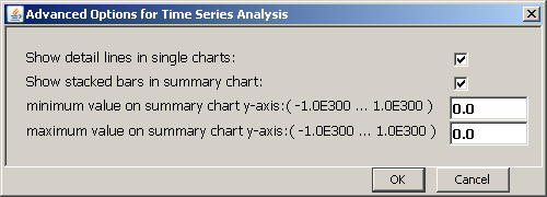
By clicking on the button Options in the toolbar you open a pop-up window which contains advanced options and settings for displaying the time series charts:
-
Show detail lines in single charts:
Activate/deactive the single value lines which appear below the total value line (red) and the total trend line (blue) in the detail charts for the various values of the grouping field.
-
Show stacked bars in summary chart:
Show the stacked bar diagram in the summary chart? Or only the summary lines (red and blue line plots)?
-
minimum / maximum value on summary chart y-axis:
Reduce the value range on the y-axis to a user-defined range.
Saving and exporting settings and results
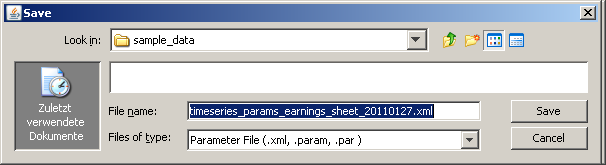
The analysis settings defined in the toolbar as well as the data import settings of the currently active data ource can be saved to a persistent parameter file by pressing the Save task button:
All data and charts may be exported to an Excel spreadsheet for further purposes:
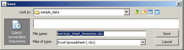
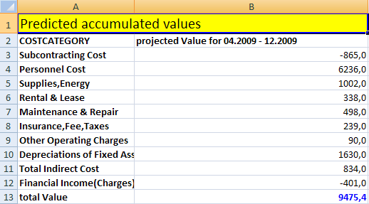
The Excel file will contain separate tabs for each kind of result, i.e. summary chart, single charts, forecast summary, data sheet: