The Module 'Multivariate Exploration'
Content
Purpose and short description
Understanding the main panel
Working with the range selector buttons
Working with detail pop-up dialogs für single fields
The bottom toolbar
Rearranging and suppressing fields
Working with the detail field selector box
Working with set-valued data fields
Creating forecasts and what-if scenarios
Purpose and short description
The data exploration module 'Multivariate Exploration' serves to study the dependencies and interrelations between the different values of several data fields in detail. To this purpose, the module displays histogram charts of all (or a user-defined subset of all) data fields on a single screen panel. By mouse-clicking the user can interactively select an deselect values and value ranges in an arbitrary combination of the histograms, thereby defining a multivariate data selection. The modifications in the field value distributions of all data fields which result from the selection are displayed in real time on screen even on very large data.
Understanding the main panel
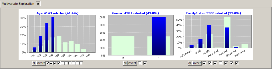
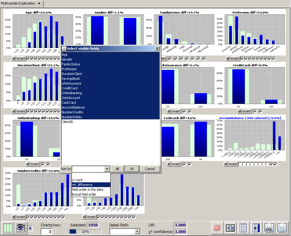
The main part of the Multivariate Exploration panel consists of one histogram chart per active data field. Each histogram chart compares a field's value distribution on the currently selected subset (blue bars) to the field's value distribution on the entire data (light green bars).
Histograms with more than 36 bars cover the entire screen width, histograms with not more than 18 bars are grouped into tupels of N charts per screen row, where N is the number entered into the tool bar input field named Charts/row. If this input field contains the value 0, the software decides autonomously how many charts to put into one screen row. Charts with 19 to 36 bars occupy twice as much horizontal space as the charts with not more than 20 bars. In order to avoid ugly gaps in the arrangements of the charts on screen, the 'large' charts (those with more than 18 bars) are placed before the 'small' charts, that means those with less than 19 bars.
In the histogram charts for non-numeric data fields, the values are arranged by descending occurrence frequency from left to right.If a data field has more then N different values, where N is the number in the input field #values (text fields) in the Input Data panel, then only the N most frequent values have been separately recorded when the data were imported. All other values have been summarized into the 'rest' value 'others'. This rest value will be represented in the chart by one single bar with label 'others'. If there is no such 'rest' value in the data, it can still be the case that there are so many different values that it is impossible to draw a histogram bar for each of them. In this case, the histogram chart will be truncated after 80 bars (you can change that value of 80 in the pop-up dialog Preferences → Multivariate Preferences). The fact that some bars could not be displayed is indicated by an additional label saying "... ?? others", where ?? is the number of suppressed bars.
Numeric data fields - such as the field Age in the picture below - often have so many different values that a binning into a small number of value ranges or intervals is reasonable. The number of bins and the bin boundaries have been defined and can be modified in the Input Data Panel.
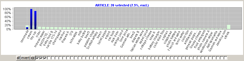
By clicking on one of the checkboxes which are situated below each chart, a value selection (restriction) can be defined for the corresponding data field. In the following screenshot, the sample data doc/sample_data/customers.txt have been imported into Synop Analyzer. Then, the Multivariate Exploration module has been started and the left checkbox below the chart for the field Gender has been deselected. That means, we have removed the male customers from the blue selected data. Hence, the latter represent the female customers, and the differences between the light green and the blue bars represent the differences between the female customers and all customers.
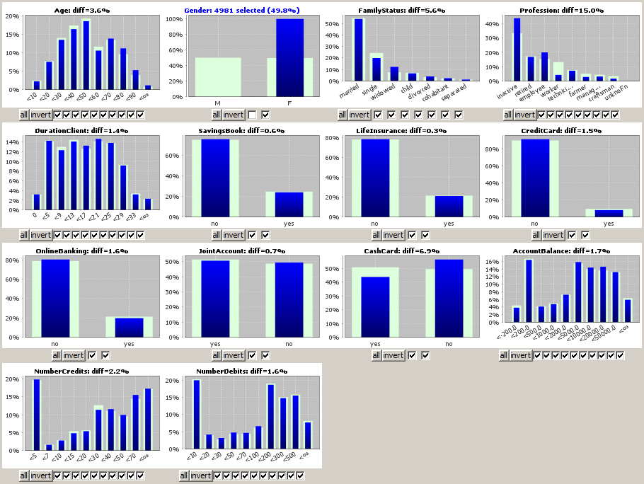
We derive from the picture that the professions of the female customers strongly differ from those of the male customers - more women are employees or inactive whereas much more men are workers - while there is almost no difference between both groups as to the possession rate of savings books, life insurances or credit cards.
The user can now interactively select an deselect values and value ranges in one or more arbitrary other data fields, thereby defining a multivariate data selection. The calculation of the overall selection is performed on an in-memory representation of the data which is optimized for those multivariate 'slicing' operations over several fields. Therefore, the results can be calculated and displayed within fractions of a second even on multi-gigabyte data.
By drawing with the mouse (keep the left mouse button pressed while moving) on a histogram chart you mark a rectangular region in which you want to zoom in.
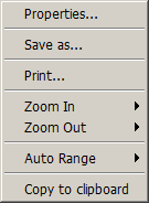
By right-clicking on a histogram chart you open the pop-up dialog shown below. In this dialog, you can modify the appearance of the histogram chart (text fonts and sizes, axis styles, labels, etc.) via the menu item Properties. You can also save the chart as PNG graphics, print it or copy it as png graphics object to the system clipboard.
Using the button Visible fields in the bottom toolbar, you can hide and remove certain fields from the charts panel in order to get a clearly arranged picture on data with many data fields.
Working with the range selector buttons
Now we want to study the possibilites of selecting and deselecting value ranges by means of the button bars below the histogram charts in more detail. To that purpose we focus on a part of the screenshot shown above, namely the histograms and button bars for the three data fields Age, Gender and FamilyStatus.
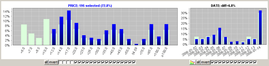
In addition to the existing range limitation on the field Gender we want to restrict the values of the field Age, namely we want to focus on the customers below 40 years. To that purpose we could deselect the six rightmost checkboxes under the histogram for field Age. A bit faster is the alternative approach of deselecting the four leftmost checkboxes and then clicking on the invert button. The invert button inverts the existing range selection on a data field. The button allremoves all ranges restrictions from the field.
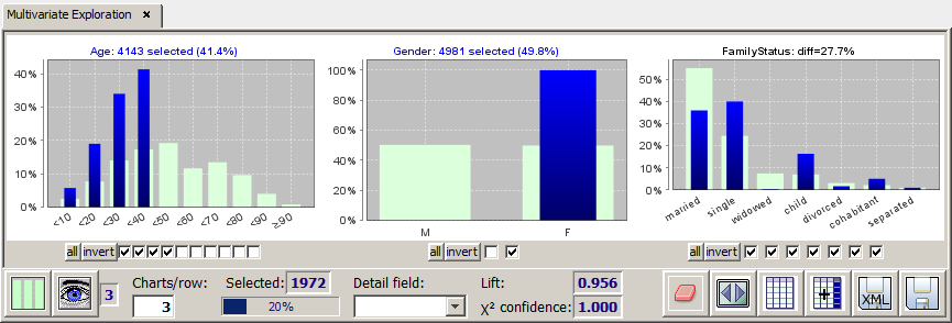
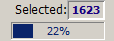
The new selection defines 4143 customers in the selected Age region. As the intersection with the existing preselection of 4981 female customers we get 1972 or about 20% young female customers (these numbers are displayed in and next to the progress bar in the bottom tool bar).
The range restriction in the field Age instantaneously changes the heights of the blue bars in all other data fields. As expected, the percentage of children and singles in the field FamilyStatus have grown significantly. The difference between the the selected subset and the light green background distribution on the entire data has grown strongly on most data fields. The displayed 'diff value is calculated as the total length of all parts of the blue bares which exceed the light green bars divided by the total length of all blue bars (the latter is always 100% if the respective field is not set-valued).
The chart titles of the fields in which we have specified a range restriction (selection) are displayed in blue; the titles of the 'response' fields in which the observed differences between blue and light green bars are a reaction of range selections in other fields are displayed in black.
Working with detail pop-up dialogs für single fields
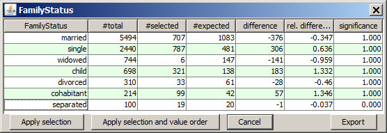
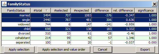
A left mouse-click on one of the histogram charts opens a tabular detail statistics which shows the field's values or value ranges and their actual and expected occurrence frequencies on the selected data. #expected is the expected number of selected data records under the assumption that the value's relative frequency on the selected data is identical to the value's relative frequency on the entire data. The columns difference and rel. difference contain the absolute and relative difference between the actual and the exected occurrence frequency. Finally, the column significance displays the result of a χ2 significance test which indicates whether the observed difference between actual and expected occurrence frequencies on the selected data are statistically significant (significance values close to 1) or not (significance values below 0.95...0.9).
If a non-numeric data field has many different values, for example far more than 100, then the available space in the histogram is not sufficient for displaying a separate bar and checkbox for each of them. In this case, the pop-up detail view is the only possibility for seeing all different values and for selecting or deselecting single values which do not figure among the 80 most frequent values. This selection or deselection can be performed by mouse-clicks on certain table rows in the detail view. If you keep the <CTRL> key pressed while clicking, you can select more than one row; by keeping the <SHIFT> key pressed you can select an entire value range. After selecting the desired table rows you activate your selection and close the pop-up view by pressing the button Apply selection.
In the details pop-up view you can also reorder the values by pressing on one of the column heads. This sorts the values ascendingly or descendingly by the values of the clicked column. Repeated clicks invert the sorting order. In the screenshot shown below, we have sorted by descending relative difference. This brings the value cohabitant to the top position. Then we have deselected the value on which the actual frequency does not significantly differ from the expected frequence, namely the value separated.
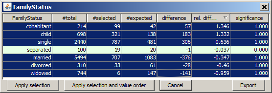
If we now leave the pop-up window by pressing the button Apply selection and value order, both the new value ordering and the value selection is applied to the histogram chart:
The details pop-up view offers yet another feature: if you right-click on one of the table cells, the following options dialog pops up:
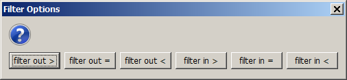
This dialog permits selecting or deselecting all table rows whose values in the column in which the click was performed are in a certain value range, and this selection can be performed by one single click. This is an enormous reduction of effort especially if the field contains hundreds or thousands of different values.
The following picture results from right-clicking on the value 321 in the column #selected and by choosing the option deactivate < in the options dialog. This choice deselects all table rows which have a value of less than 321 in the column #selected.
The bottom toolbar
The tool bar at the lower screen border provides the following buttons and functions:

-
 :
:
Toggle the histogram display mode. This button opens a pop-up panel in which the chart type (histogram bar chart, line chart or area chart) and the display mode can be selected. In the default display mode, the sum of all light-green background bar heights is 100% ('sum mode').
In the option mode, the so-called 'single mode', each single light-green background bar is rescaled to 100%. This second mode is particularly useful for studying the relative frequency differences between the selected data and the overall data on the various values or value ranges of a data field.
-
 :
:
Via this button you open a pop-up dialog which permits to hide certain data fields from the histogram chart panel. This feature is described in more detail in section Rearranging and suppressing fields. The blue number to the right of the Visible fields button shows the total number of remaining visible fields.
-
Charts/row
In this input field you can specify how many of the 'normal' histogram charts with not more than 18 bars should be put into one single screen row. The smaller the number, the larger will be each single histogram chart.
-
 :
:
The progress bar and the text field Selected show the size of the currently selected subset of the data: the number in the progress bar is the percentage of the entire data; the number to the right of the Selected label is the absolute number of selected data records (or data groups if a group field has been specified).
Left clicking with the mouse on the progress bar or the output field showing the number of selected data groups opens a pop-up window which shows the currently applied selection criteria in the form of a SQL SELECT statement. By pressing a button in the pop-up window, you can copy this statement into the system clipboard and insert it from there into a SQL script which you can then deploy on your database management system.
Right clicking with the mouse on the progress bar or the output field showing the number of selected data groups opens a pop-up window which serves to deactivate all value ranges in all visible data fields in which the currently selected data subset is empty or significantly under-represented. The number entered into the pop-up window's input field defines the minimum degree of under-representation required for deselecting a value range. The predefined default value is 0.33. That means, all histogram bars in which the blue bar's height is less than one third of the green bar's height will be deactivated.
-
Detail field:
By means of the selection box named 'Detail field' you can specify one data field whose value distribution within each single histogram bar representing the selected data will be graphically displayed using different colors instead of the uniform blue bar color. More information on this feature can be found in section Working with detail structure fields.
-
Lift:
The text field Lift indicates whether the combination of field value ranges defining the current selection 'attracts' or 'repulses' each other. A lift value of 1.0 indicates that the different selected field value ranges are statistically independent: lift values larger than 1.0 (less than 1.0) indicate that the different selected value ranges occur more (less) frequently together than expected in the case of statistical independence.
-
χ2 Confidence:
The text field χ2 conf. contains the statistical confidence that the selected subset differs significantly from the entire data in at least one data field's value distribution. More formally spoken, the value is the confidence level with which the hypothesis «The currently selected subset has the same value distribution in all data fields as the entire data» is rejected by a χ2 significance test.
-
 :
:
Undo all range restrictions; select all data records.
-
 :
:
By clicking on this button you re-draw all histogram charts, thereby adapting their size to the current screen width.
-
 :
:
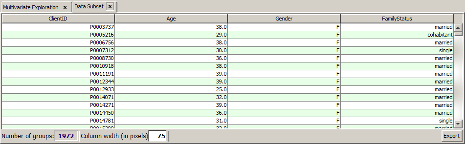
This button opens a new panel which contains the currently selected data records in tabular form. In the panel, you can sort the selected data by any data field and export the extire selection or a subset into a flat file or spreadsheet.
-
 :
:
This button appends a new two-valued (Boolean) data field to the data. The new field represents the current selection: it contains '1' for all data records or data groups which are contained in the current selection, and '0' for those ones not contained in the current selection. You can specify the name if the new field in a pop-up dialog which opens up after pressing this button.
-
 :
:
This button transforms the current selection of data records or data groups and the currently visible data fields into a new data source within Synop Analyzer. The new data source is automatically opened as a separate tab in the left column of Synop Analyzer workbench. You can then apply all Synop Analyzer analysis modules to this new data.
-
 :
:
By pressing this button, you can save the currently active data import settings and all settings performed in this module to a persistent XML parameter file. This file can later be opened via Synop Analyzer's main menu (Analysis → Run Multivariate Exploration). In this way you can exactly reproduce the current data analysis screen without to be obliged to re-enter all settings and customizations.
-
 :
:
Export the current data exploration results within this module into a spreadsheet in .xlsx format (MS-Excel© 2007+). The spreadsheet contains several worksheets: one with a single PNG graphics for each histogram chart, one with a single PNG graphics for all charts, a data sheet which contains the selected data records, and one more worksheet for each detail pop-up window which ever has been opened by mouse-clicking on one of the histogram charts.
Rearranging and suppressing fields
Clicking on the button Visible fields opens a pop-up dialog in which the following actions can be performed:
-
Hide certain data fields so that no histogram is displayed for them. You can hide a field by left-clicking the field name while keeping the <CTRL> key pressed.
-
Rearrange the histograms on screen: if you draw a field name with the mouse to another vertical position and release the left mouse key there, the field name is moved to the new position. Note: moving a field name is only possible within its 'group'. The data fields with many different values and large histogram charts form the first group, the fields with normally sized charts form the second group.
-
Sort the data fields with respect to a user-selected filter criterion. The pull-down menu named Sort by at the lower border of the Visible fields pop-up dialog makes it possible to sort and reorder the displayed histograms with respect to a couple of sorting criteria. The meaning of the criteria lexical field order, field order in the data and correlation with detail field should be evident. The criterion rel. difference sorts the fields on which a manual range restriction has been defined at first place and then the other fields sorted by descending diff value.
The criterion χ2 conf also places the fields with manual range restrictions in front, followed by the other fields sorted by decreasing χ2 confidence value. The χ2 confidence value indicates the level of confidence of the assertion that the value distribution of the blue selected data significantly differs from the value distribution of the light green overall data. In general, this criterion has some similarity and correlation with the criterion rel. difference. However, a small relative difference of, say, 1% can be very significant on a field with many data records only very few different field values, whereas a relative difference of 10% can be non-significant on a field with many different values and few data records.
-
Exchange the quantitative difference measure shown in the charts' titles. After selecting the option Sort by → χ2 conf, in the Visible fields dialog, the chart titles display the difference measure χ2 conf. Sorting by rel. differeence switches back to displaying the relative difference (diff).
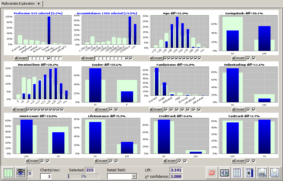
In the following we want to demonstrate some of the options and functions with the help of a concrete example. We again start with the sample data doc/sample_data/customers.txt and we select the 1950 customers with an account balance of at least 20,000. Now we open the pop-up window Visible fields and choose Sort by → rel. difference.
The displayed field order on the main panel has changed. The selection field AccountBalance has been placed first, followed by Age and Profession, on which the difference between the selected data and the overall data is largest (26.6% and 23.0%).
It is not a big surprise thal pensioners and people elderly people often have a large account balance. More surprising is the fact that farmers are strongly over-represented in the group of people with an accoutn balance of 20000 or more. We want to introspect this group a bit closer, hence we select Profession=farmer. Then we again sort the fields by decreasing relative difference. The following picture arises. It shows that farmers with large bank accounts typically have the following characteristics:
-
A medium age (30 to 70 years)
-
They own a savings book
-
High customer loyalty and long-term customer relationship of more than 20 years
-
They are mainly male.
Working with detail structure fields
Using the selector box Detail field one can add graphical detail information to the histogram bars which represent the selected data subset.
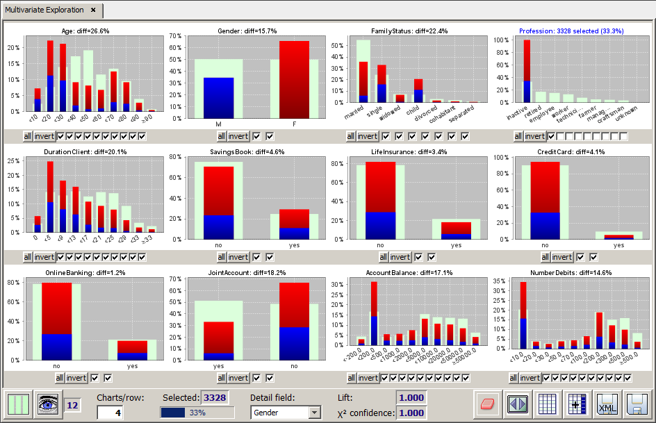
In the screenshot below, for example, the profession inactive has been selected, and the gender distribution (male/female) of this selected data subset has been shown on 12 data fields. This was achieved by choosing the field Gender as the detail structure field. As it can be seen from the histogram for the data field Gender, the red parts of the bars represent the females, the blue ones the males.
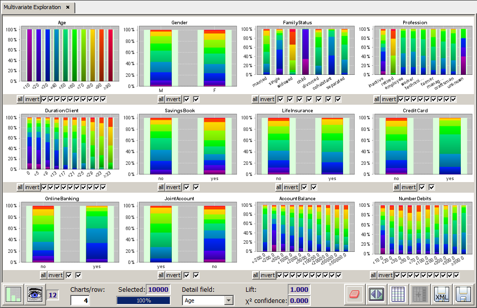
We want to mention a particular application scenario of working with a detail field: if all data are selected and if the display mode 'all histogram bars have the same length (100%)' has been selected, specifying a detail field has the effect of creating a collection of many bivariate field-field matrix charts, the y-axis field of all bivariate charts being the detail structure field.
In the following picture we show an example for this application scenario. In the example, the field Age has been selected as the detail structure field.
Working with set-valued data fields
If the examined data contain set-valued textual fields, multivariate exploration requires particular care and attention when interpreting the displayed results. Set-valued fields can emerge when a group field has been defined on the data. 'Set-valued' means that within one single data group the field can assume more than one different value. For example, the field PURCHASED_ARTICLE could comprise several different purchased articles on the data group TICKET_ID=3126.
In the following we want to demonstrate the arising subtleties using the sample data doc/sample_data/RETAIL_PURCHASES.txt. We assume that these data have been imported into Synop Analyzer as described in Name mappings, that means with PURCHASE_ID as group field and with doc/sample_data/RETAIL_NAMES_DE_EN.txt as article names. In these data, the field ARTICLE is set-valued with respect to the group field PURCHASE_ID: normally, a purchase comprises several different articles.
The screenshot below was obtained by deactivating the three most frequent values in the field ARTICLE and by pressing the button invert afterwards. We expect to obtain blue bars only for the first three bars in the histogram, but we find blue bars for almost all other values, too. Why?
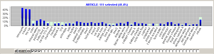
In order to answer this question, we must remember that for the set-valued data field ARTICLE, selecting the three articles can have two different meanings:
-
Select all purchases (ticket IDs) which exclusively consist of the three selected articles and which do not contain any other article. We call this the exclusive selection mode.
-
Select all purchases which contain at least one of the selected articles. We call this selection mode the non-exclusive mode.
Obviously, the histogram shown above interprets the selection task as 'non-exclusive' selection. Therefore, the selected purchases also contain many other articles in addition to the three selected articles. Can one switch to the exclusive selection mode in Synop Analyzer? To this purpose there is an additional button ex next to the invert button. Each click on this button toggles the exclusivity mode of the current selection.
If one clicks on the ex button in the histogram shown above, one obtains the following histogram:
As desired, this histogram displays only those 20 purchases in which no other articles than the selected three articles were purchased. The fact that we now are in 'exclusive' mode is indicated by the text (excl.) in the title of the histogram chart.
In addition, the software applies the following principles when dealing with set-valued fields:
-
If one starts with a data field without range limitations (all checkboxes marked) and begins deactivating single checkboxes, then Synop Analyzer automatically switches into the exclusive selection mode. This corresponds to the intuitively expected behaviour: by deactivating a checkbox I tell the software that I do not want to see those purchases which contain the deselected article.
-
Pressing the invert button does not only invert the selection but also switches from exclusive to non-exclusive mode and vice versa. This is also the intuitively expected behaviour: if I deactivate a value, I want to see the data groups which do not contain the value. If I invert this task then I want to see the data groups which definitely contain the value, but which can contain other values, too). The two selections between which the invert switches back and forth are disjunct, and their combination is the entire data.
-
All other actions which can be performed using the checkboxes or in the details pop-up view do not change the selection mode.
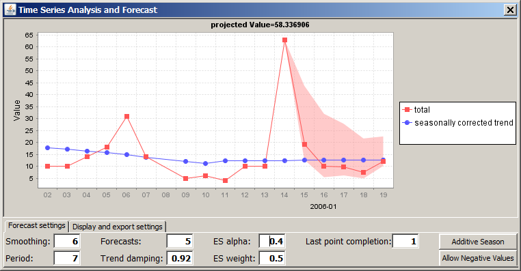
Creating forecasts and what-if scenarios
For numeric data fields with a date or timestamp data format, Synop Analyzer is able to start a time series analysis and forecast by clicking on a special button below the field's histogram chart. This special button is situated next to the button all and displays a time series plot as button icon.
In the following we want to give an example based on the sample data doc/sample_data/RETAIL_PURCHASES.txt. We assume that these data have been imported into Synop Analyzer as described in Name mappings, that means with PURCHASE_ID as group field and with DATE as order (timestamp) field.
The field DATE has the additional time series forecast button. We select all purchase prices of 10 EUR or more, then we press the forecast button.
A pop-up dialog opens up. Its content corresponds to the content of the time series forecast panel which can be started from the analysis module button list in the lower part of the left screen column of Synop Analyzer. We refer to section Time Series Analysis and Forecast for a more detailed description of the available buttons and functions. Here, we only show and example. It shows the forecast created when assuming a period (cyclic pattern) of 7 days and a forecast period (in days) of 5: