|
||||||||
| FRAMES NO FRAMES | ||||||||
Understanding the main panel
The bottom toolbar
Rearranging and suppressing fields
Working with set-valued data fields
Optimizing the control data
Automatized series of split analyses
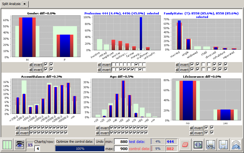
Split Analysis is a data analysis approach in which two data subsets are selected: a 'test' data set and a 'control' data set. In many use cases, the test data set comprises a data subset whose data records have a certain property in common, for example all men, all customers below the age of 30, all vehicles produced after an improvement measure has been effectuated, etc. The first goal of the analysis is to select a suitable control group which is representative for the test group in all attributes except the ones used for defining the test group. The second goal is to find and quantify significant differences between the test data subset and the control data subset.
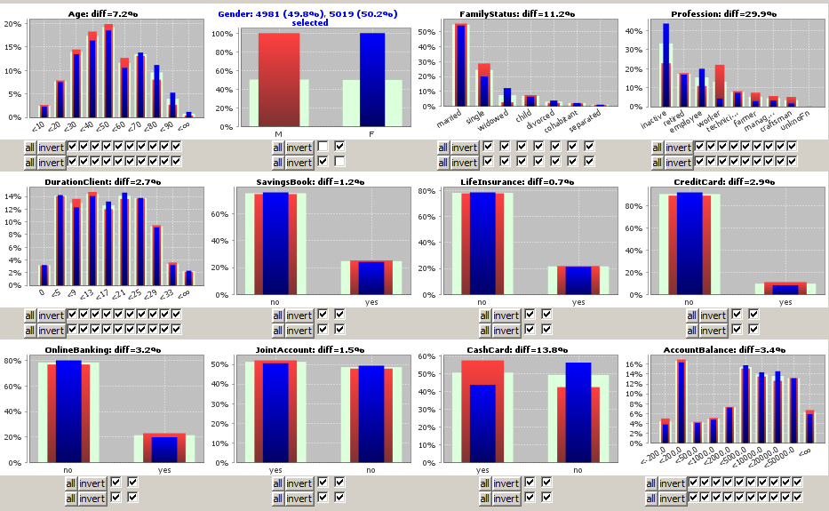
The main part of the Split Analysis panel consists of one histogram chart per active data field. Each histogram chart compares a field's value distribution on the currently selected test data (blue bars) to the field's value distribution on the currently control data (red bars) and on the entire data (light green bars).
Histograms with more than 36 bars cover the entire screen width, histograms with not more than 18 bars are grouped into tupels of N charts per screen row, where N is the number entered into the tool bar input field named
In the histogram charts for non-numeric data fields, the values are arranged by descending occurrence frequency from left to right.If a data field has more then N different values, where N is the number in the input field
Numeric data fields - such as the field Age in the picture below - often have so many different values that a binning into a small number of value ranges or intervals is reasonable. The number of bins and the bin boundaries have been defined and can be modified in the Input Data Panel.
By clicking on one of the checkboxes which are situated below each chart, a value selection (restriction) can be defined for the corresponding data field. The upper row of checkboxes specifies the selection defining the test data subset the lower row specifies the selection defining the control data subset.
In the following screenshot, the sample data
We derive from the picture that the professions of the female customers strongly differ from those of the male customers - more women are employees or inactive whereas much more men are workers - while there is almost no difference between both groups as to the possession rate of savings books or credit cards.
The user can now interactively select an deselect values and value ranges in one or more arbitrary other data fields, independently for the test data and the control data, thereby defining two multivariate data selections. The calculation of the two overall selections is performed on an in-memory representation of the data which is optimized for those multivariate 'slicing' operations over several fields. Therefore, the results can be calculated and displayed within fractions of a second even on multi-gigabyte data.
By drawing with the mouse (keep the left mouse button pressed while moving) on a histogram chart you mark a rectangular region in which you want to zoom in.
By right-clicking on a histogram chart you open the pop-up dialog shown below. In this dialog, you can modify the appearance of the histogram chart (text fonts and sizes, axis styles, labels, etc.) via the menu item
Using the button
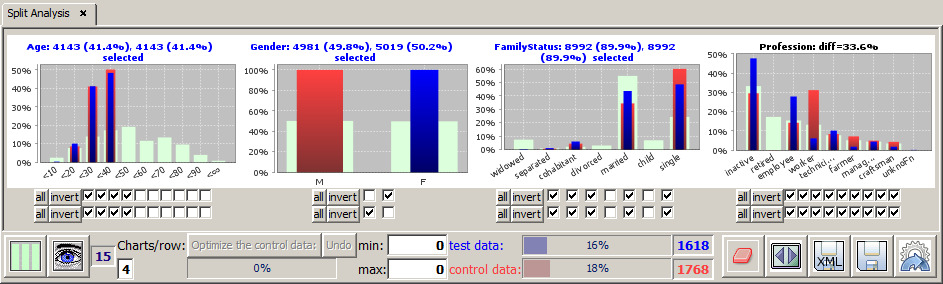
Now we want to study the possibilites of selecting and deselecting value ranges by means of the button bars below the histogram charts in more detail. To that purpose we focus on a part of the screenshot shown above, namely the histograms and button bars for the four data fields Age, Gender, FamilyStatus and Profession.
In addition to the existing range limitation on the field Gender we want to restrict the values of the field Age, namely we want to focus on the customers below 40 years. To that purpose we could deselect the six rightmost checkboxes under the histogram for field Age. A bit faster is the alternative approach of deselecting the four leftmost checkboxes and then clicking on the
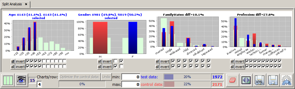
The new selection defines 4143 customers in the selected Age region. As the intersection with the existing preselection of 4981 female respectively 5019 male customers we get 1972 or about 20% young female and 2171 or about 22% young male customers (these numbers are displayed in and next to the progress bars in the bottom tool bar; the blue bar represents the test data, the red one the control data).
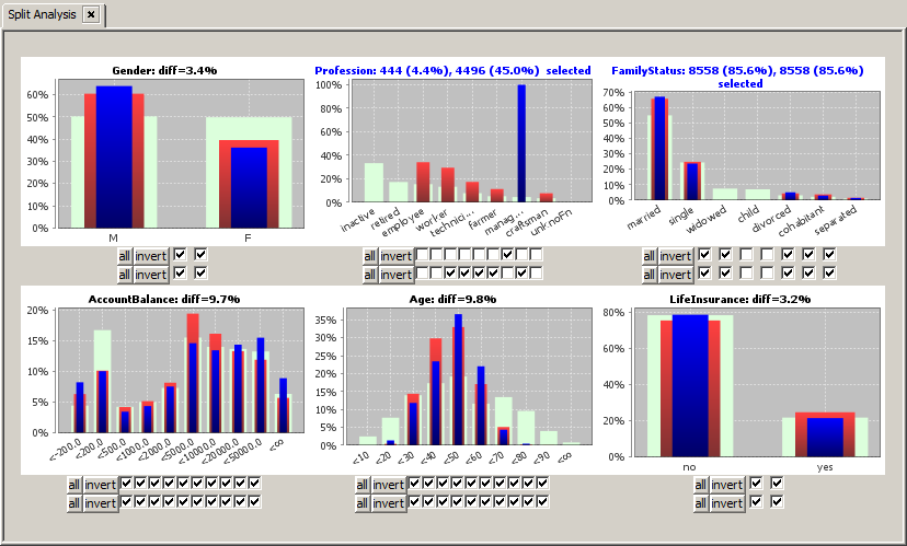
The range restriction in the field Age instantaneously changes the heights of the blue and red bars in all other data fields. As expected, the percentage of children and singles in the field FamilyStatus have grown significantly. The difference between the two the selected subsets and the light green background distribution on the entire data has grown strongly on most data fields. In contrast, the differences between the two selected groups on the fields FamilyStatus and Profession, which are displayed in the respective chart titles, have declined. The displayed '
The chart titles of the fields in which we have specified a range restriction (selection) are displayed in blue; the titles of the 'response' fields in which the observed differences between blue, red and light-green bars are a reaction of range selections in other fields are displayed in black.
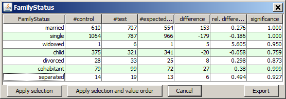
A left mouse-click on one of the histogram charts opens a tabular detail statistics which shows the field's values or value ranges and their actual and expected occurrence frequencies on the test (
If a non-numeric data field has many different values, for example far more than 100, then the available space in the histogram is not sufficient for displaying a separate bar and checkbox for each of them. In this case, the pop-up detail view is the only possibility for seeing all different values and for selecting or deselecting single values which do not figure among the 80 most frequent values. This selection or deselection can be performed by mouse-clicks on certain table rows in the detail view. If you keep the <CTRL> key pressed while clicking, you can select more than one row, by keeping the <SHIFT> key pressed you can select an entire value range. After selecting the desired table rows you activate your selection and close the pop-up view by pressing the button
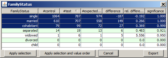
In the details pop-up view you can also reorder the values by pressing on one of the column heads. This sorts the values ascendingly or descendingly by the values of the clicked column. Repeated clicks invert the sorting order. In the screenshot shown below, we have sorted by descending relative difference. This brings the value widowed to the top position. Then we have deselected all values on which the differences in relative frequency between the test and the control data is not significant at a confidence level of at least 90%.
If we now leave the pop-up window by pressing the button
The details pop-up view offers yet another feature: if you right-click on one of the table cells, the following options dialog pops up:
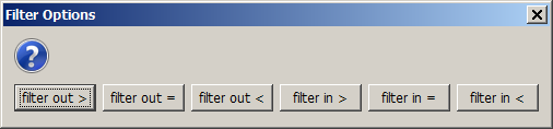
This dialog permits selecting or deselecting all table rows whose values in the column in which the click was performed are in a certain value range, and this selection can be performed by one single click. This is an enormous reduction of effort especially if the field contains hundreds or thousands of different values.
The following picture results from right-clicking on the value 99 in the column #test and by choosing the option
The tool bar at the lower screen border provides the following buttons and functions:

Clicking on the button
In the following we want to demonstrate some of the options and functions with the help of concrete examples. We again start with the sample data
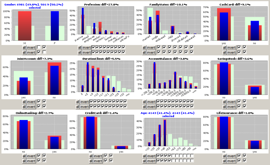
The field order and the number of displayed fields in the main panel changes: the field Gender, in which the two selected groups have a relative difference of 100%, is placed at the top position, followed by the fields Profession and FamilyStatus on which the difference between young males and femals is strongest (27.8% respectively 10.1%).
If the examined data contain set-valued textual fields, the split analysis requires particular care and attention when interpreting the displayed results. Set-valued fields can emerge when a group field has been defined on the data. 'Set-valued' means that within one single data group the field can assume more than one different value. For example, the field PURCHASED_ARTICLE could comprise several different purchased articles on the data group TICKET_ID=3126.
The difficulties when dealing with set-valued fields is caused by the fact that it is not any more unambiguously clear what activating or deactivating a check box representing a histogram bar means:
In the reference documentation of the module Multivariate Exploration we show in detail how Synop Analyzer can switch between these two different selection modes. That explanation applies one to one also to the split analysis module, therefore we refer to that part of the documentation and do not repeat the explanations here.
A split analysis is performed with the aim of finding significant differences in the value distributions of one or more 'target' data fields between two data subsets: the 'test' subset, whose values have certain values in one or more 'selector' data fields, and the 'control' subset, whose valuesdo not have those values in the selector data fields. Unfortunately, in most real-world situations, there are inevitably many other differences between the two data subsets in addition to the desired ones. Therefore, one can not be sure whether the observed differences in the 'target' fields are caused by the controllable differences in the 'selector' fields or whether they are due to uncontrollable differences in some other data fields.
In order to make this more concrete, let us consider an example from applied social studies based on the sample data
»the Managers are more frequently divorced than people with other professions but similar socio-economic background.«
The available data contain six data fields which define the profession, the marital status and the socio-economic background: Gender, FamilyStatus, Profession, Age, and the 'wealth-indicators' LifeInsurance and AccountBalance. We want to verify the hypothesis stated above by selecting a suitable group of managers as the test group and a group on non-managers as control group.
We import the data and start the module
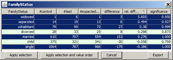
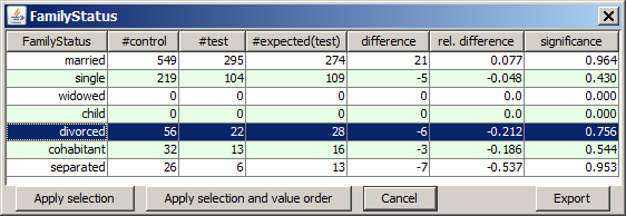
When we open the details view for the field FamilyStatus by left-clicking on the histogram chart, our hypothesis seems to be proved - at least by trend.
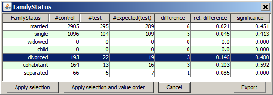
The table row highlighted in blue contains the result we are interested in. The row reads as follows: In the test data (managers) there were 22 divorced persons. If the percentage of divorced persons was identical to the percentage of divorced persons in the control group, we would only have 19 divorced managers. 22 minus 19 is an absolute difference of 3 and a relative difference of +14.9%. Unfortunately, the data sample (the number of cases) is not large enough so that the result is not yet really significant (confidence level strongly below 90%).
However, the preliminary result stated above is not really valid. The control group differs significantly from the test group in the value distributions of the data fields Age, Gender, LifeInsurance and AccountBalance. Therefore, it is unclear whether the observed differences in divorce rates are caused by the differring professions or the differences in the other fields.
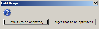
Here, we can use Synop Analyzer's control data optimization feature, which aims at making the control data 'representative' for the test data in a couple of user-defined data fields. First, we have to tell Synop Analyzer which is the target field of our hypothesis. To that purpose, we open the
Now we optimize the control data, making them representative for the test data in all data fields but the target field and the selector field Profession. We use the tool bar fields 880 as the minimum and 900 as the maximum value. Then we press the button
A moment later, the control data size has dropped to 882 data records, and the control data's value distributions on the four data fields to be optimized are perfectly identical with the respective value distributions of the test data. If we now open the details view of the field FamilyStatus, we get a result which differs strongly from our preliminary result:
We see that when working with 'representative' control data, the profession Manager has no pushing impact on the divorce rate. On the contrary, there are less divorced managers then expected from the other profession groups (even though this tendency is not really statistically significant, the confidence level is only 75%). We understand how important it is to optimize the control data before deducing conclusions from a split analysis.
Often, it is desirable to perform large series of similar split analyses. For example, we could repeat the split analysis performed in the previous section for all other professions, not only for managers. And maybe we would like to repeat the entire series of split analyses every 3 months in order to monitor socio-demographic trends.
For both goals, an automatized scheduling of many similar split analysis tests is required. Synop Analyzer provides the button
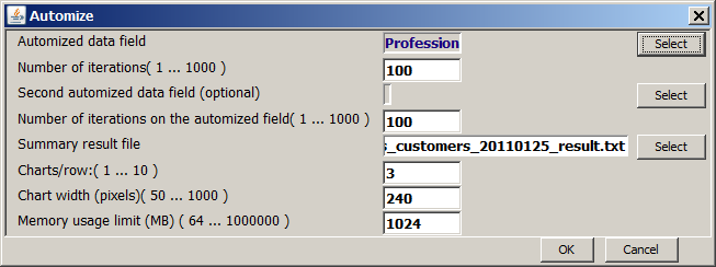
In this view we define in the first row, over which data field the series of split analysis tasks is supposed to iterate. The selection box offers all data fields in which exactly ine field value is currently activated on the test data and some other values are activated on the control data. In our example, only the field Profession satisfies these requirements.
The second row defines the maximum number of iterations over the field specified in the first row the series is to be terminated. The default value is 100. Since we only have 6 different professions in the data, we can leave that value unchanged, it has no effect; we could also enter 6 here.
In the third and fourth row, one can define a second data field to iterate over. In our example, there is no suitable second field for iterating over.
Then, we specify the name of the summary result file - a <TAB> separated text file which can be opened in MS Excel and which contains one line of summary information for each single split analysis performed during the series. Finally, there are three parameters with which you can modify the graphical representation of the single tests' results, and a parameter which defines the maximum amount of computer memory to be available when running the automatized analysis series.
In addition to the summary result file, the automatized series of tests will create one separate spreadsheet file per single test (iteration) which contains the same results that one would obtain if one manually executed the singe split analysis and then pressed the
As soon as one presses